As probably many of you already know, it is a tradition for us to wrap our (nearly) annual showreel
into a short film. The year 2019 was no exception of course, so this is how our Unter freiem Himmel anime opening saw
the light of day.
As probably many of you already know, it is a tradition for us to wrap our (nearly) annual showreel
into a short film. The year 2019 was no exception of course, so this is how our Unter freiem Himmel anime opening saw
the light of day.
But what is this „anime“, how was the opening created and why does Michi wear tights in it?
My name is Martin, this animation was part of my bachelor thesis, and I will answer some of these questions. But because this project is very dear to our hearts and there is far too much to tell about it, I want to split this into several parts. Today, I'm writing about the pre-production and idea development, in the sequel I'll go into the nuances of the implementation.
So…
As is often the case, the origin of this idea can be found in the 90s. The Nokia 3210 saw the light of day, "Anton aus Tirol" leads the Austrian charts and Japanese imports like Tamagotchi, Nintendo consoles and anime series were the latest trend among pubescent teenagers. During this time, series like Dragonball Z, Sailor Moon and Captain Future left a deep impression in Bens, Gernots and Michis minds; they‘re still passionate anime fans today.
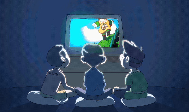
The opening music of these anime series were notorious for their catchy tunes and have been immortalized in the long-term memories of many 90s kids. So it was only a matter of time until the three of them would fulfill a dream and create a catchy opening themselves. And I was lucky to have applied for an internship at exactly the right time. I'm a big fan of these series myself and specialize in hand drawn animation, as it is used for the production of anime. Of course I was very enthusiastic about the idea!
So we started the conception phase in February 2019.
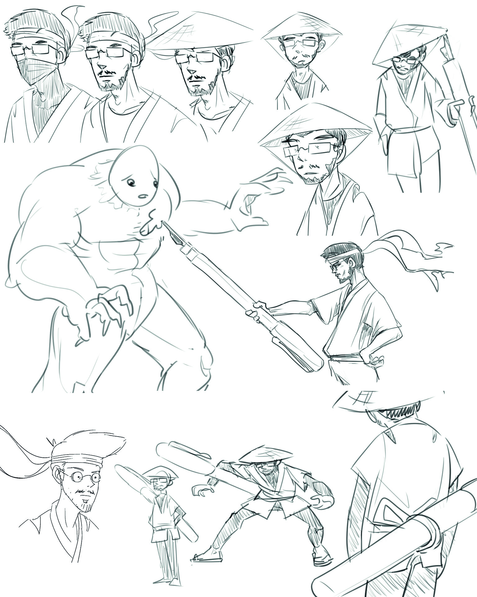
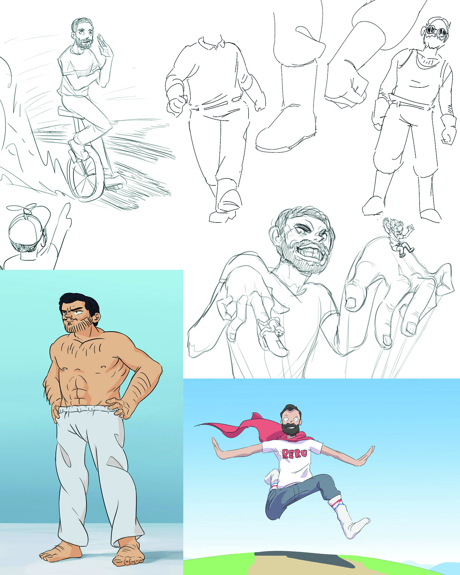
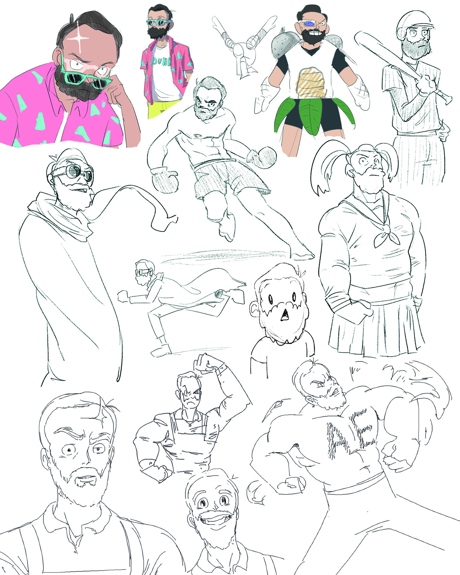
The first step was to turn the three guys into believable anime characters. For this we did a lot of research (aka watching Anime). Various anime series and especially their openings were closely examined and discussed. We especially looked for cliche situations and character traits that might fit the three of them. This resulted in a lot of sketches with the mindset: "Throw everything against the wall and see what sticks.“
Here is a little insight:
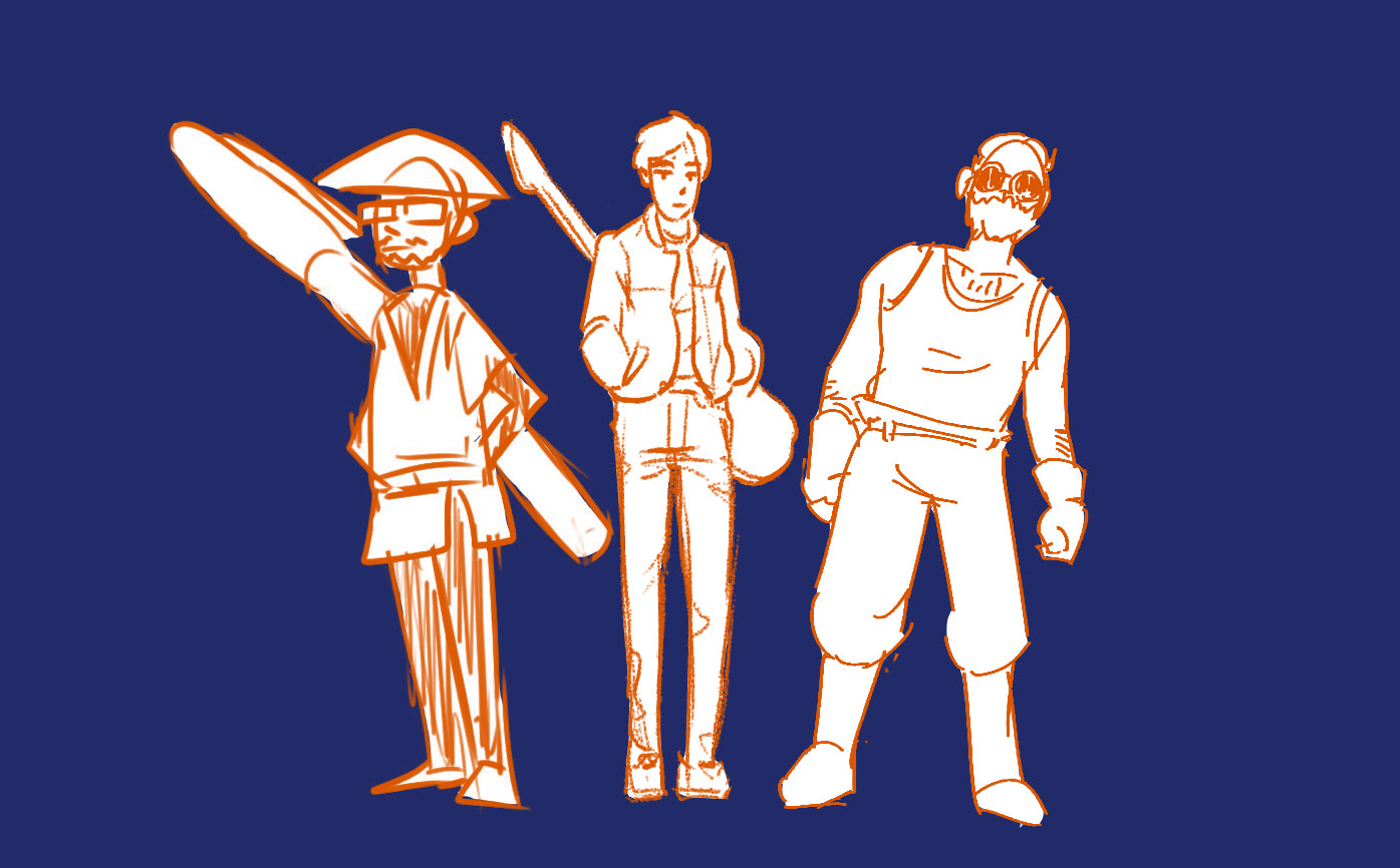
After much back and forth we finally decided on these three variations:
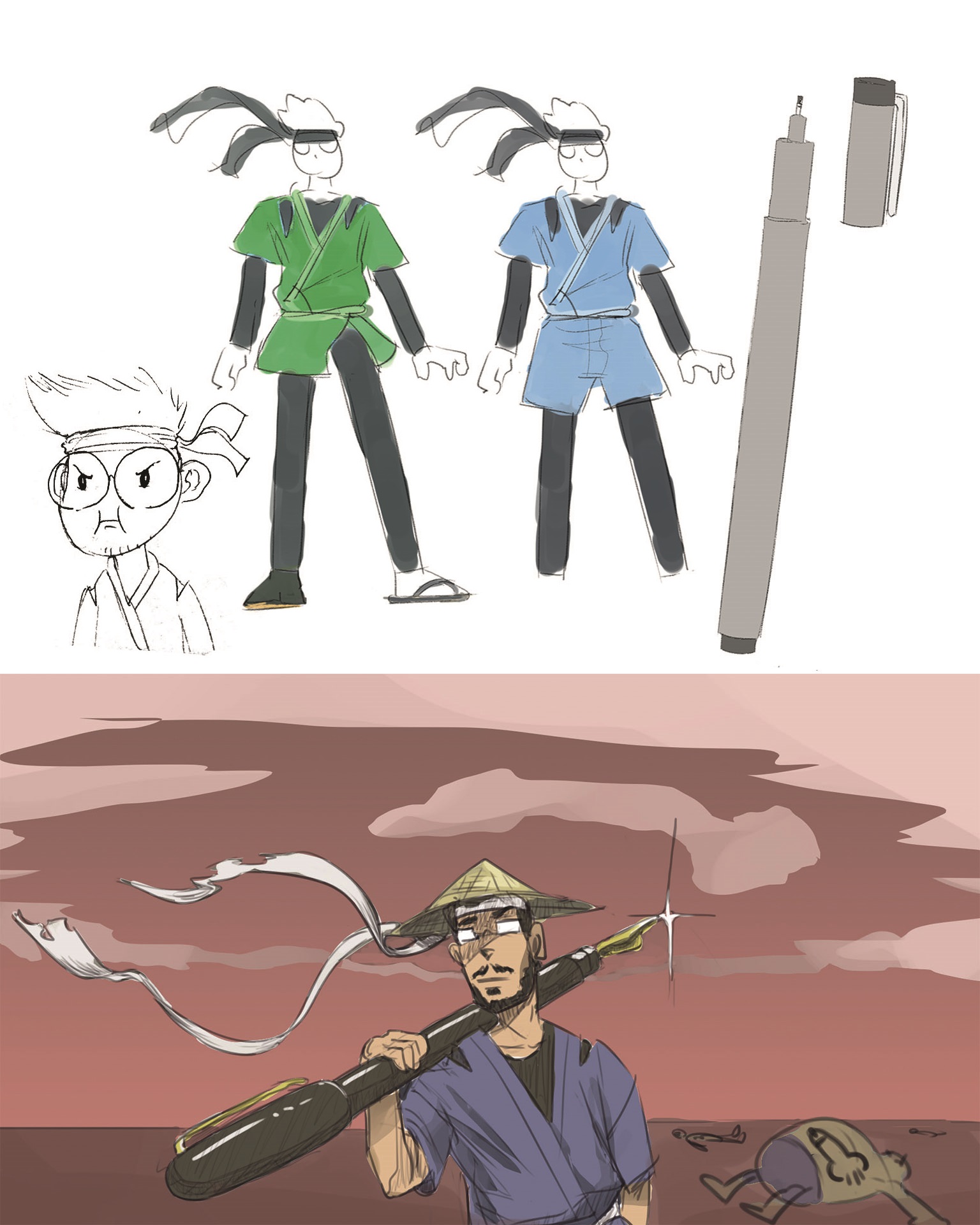
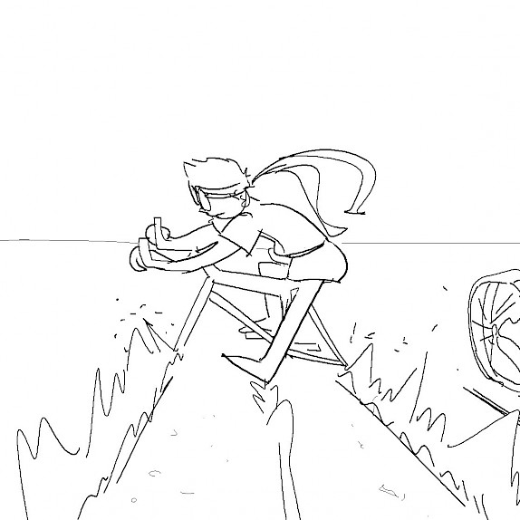
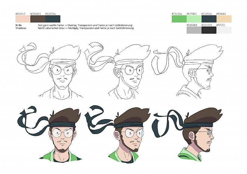
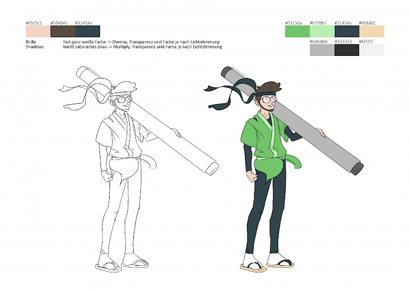
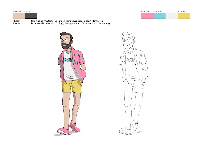
Michi - the pen-wielding samurai with a broken bicycle
Since Michi is the illustrator of the company, it was clear from the beginning that he would be armed with a pen. This idea was combined with a classic Samurai cliche, which I can best describe with this drawing.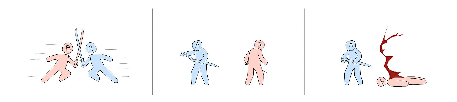
For the design of Michi‘s character, we were mainly inspired by the Naruto and One Piece series. His everday bike is often broken - we used this as a pretext to install an Akira Bikeslide.
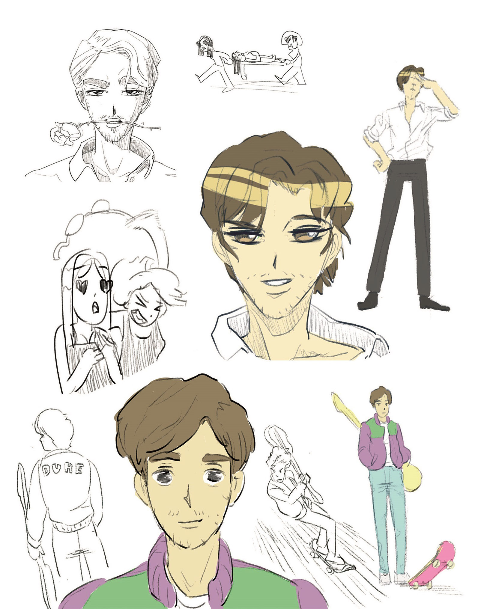
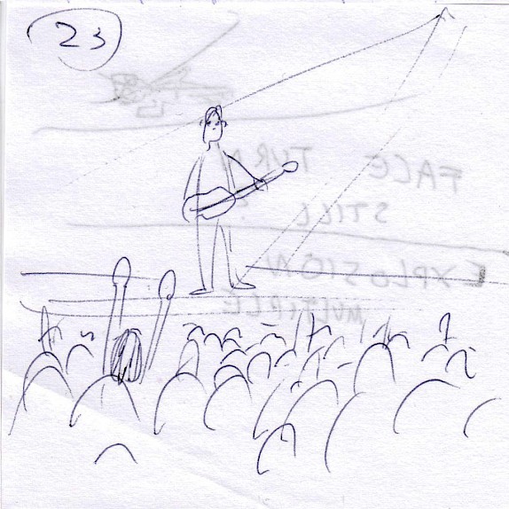
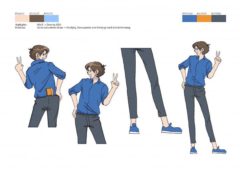
Gernot – the "pretty boy" of middle age who undresses his fans with the power of music and fights villains with his clever notebook
Gernot is mainly responsible for concepts, sound design and to „charm“ the customers of Unter freiem Himmel. Therefore we combined the charismatic charmer a la Tuxedo Mask with Sailor Moon and a rock star. In addition, he always carries a small notebook with him that he uses to forge clever plans. For this we were inspired by the Golden Boy series.
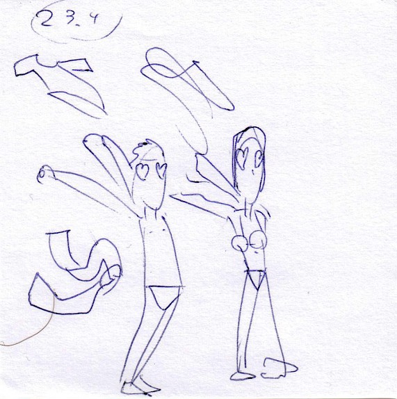
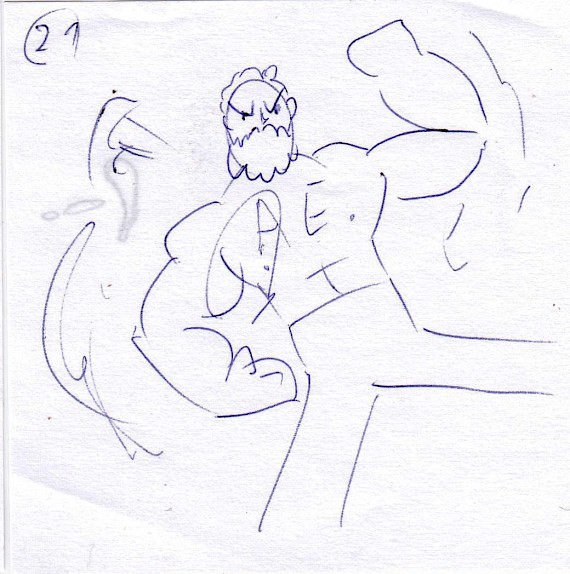
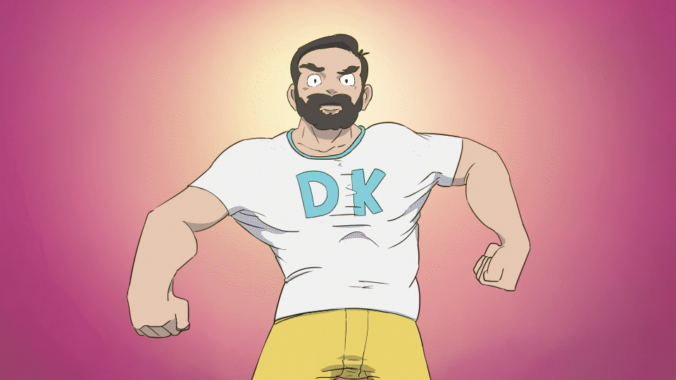
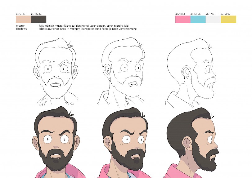
Ben – the muscular puppeteer in an 80s outfit with a shiny forehead and constantly changing T-shirt slogans
For Ben's character we had planned a dramatic puppeteer right from the start, because that's not far from what he does in the company: He animates characters. Additionally we were influenced by the casual clothing of various Dragonball Z characters. Bright 80s outfits with random word prints like "Postboy" or "Badman". So we decided to give Ben a different arbitrary t-shirt print in every scene of the opening. Last but not least, we wanted to pay homage to shirt-busting musclemen like the ones you know from Castle in the Sky or Fullmetal Alchemist. In my opinion, Ben was the perfect candidate for the job.
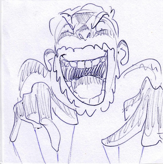
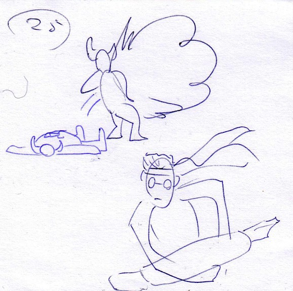
In addition to researching and drawing, small animation tests and storyboards were created. These show the characters fighting against enemy monsters and helped to further develop our heroes. These tests are very rough and incomplete, but some of the ideas made it into the final opening, e.g. Michi, who paints on the monster.
After all the conceptual work we already had a lot of ideas of how the opening could play out. But since the animation process is very time-consuming, we had to give up or shorten many ideas. We also limited ourselves to a maximum opening length of 50 seconds. But these were gonna be packed with action, drama and anime cliches!
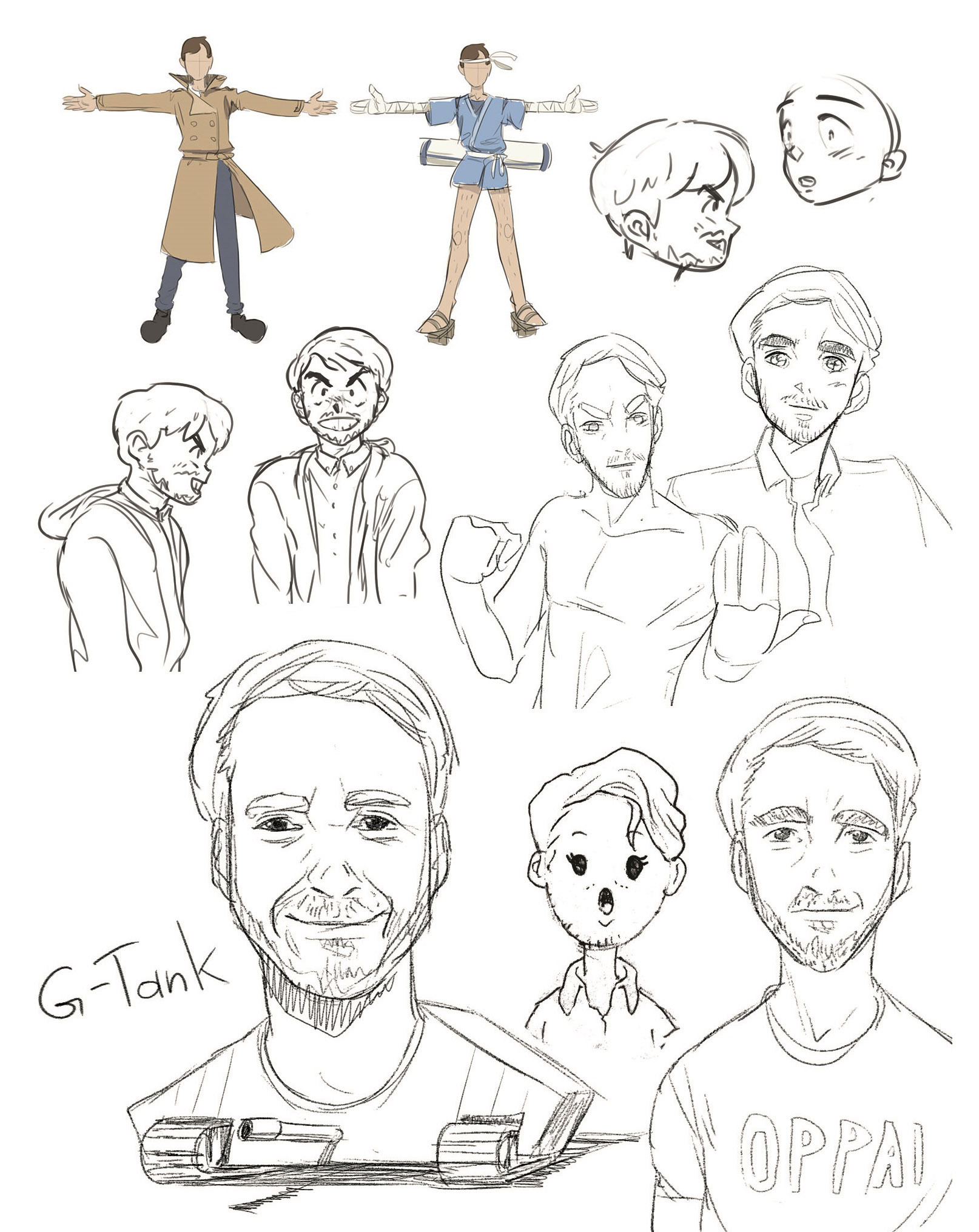
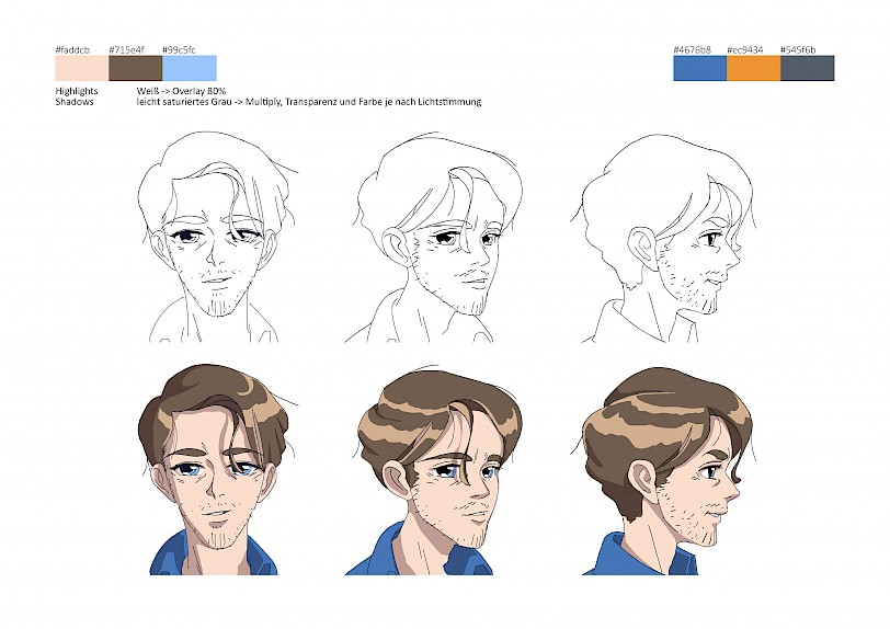
Since we now had a rough picture of the plot and the characters in mind, I could start with the character design.
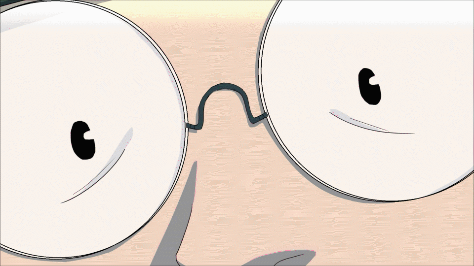
It was important that the three guys are recognizable at a glance. But because they all got pretty much the same amount of facial hair, Anime Michi and Anime Gernot had to give away plenty of beard to Anime Ben. He also got glorious chest hair in his muscle form. Identification features were generally emphasized: Michi's glasses are bigger, Gernots gaze is more intense and Ben's eyebrows are more spectacular.
The designs were kept rather minimalistic so that they could be drawn quickly. To get closer to the detailed anime standard, shadows and highlights were used. So the characters appeared more threedimensional and the shadows could be used as a dramaturgical tool. Elements like hair or clothes were designed with simple shapes so that they could be easily animated later and would add more dynamism to the movements. Finally, the three were dressed in individual colors. Voilà!
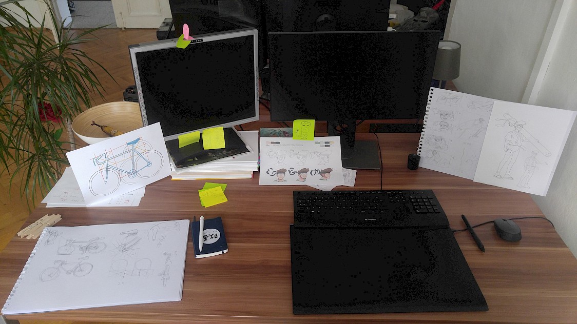
In addition to the regular model-sheets I created simplified guides, which were later helpful for the rough animation. Here you can only see the basic shapes and proportions of the characters.
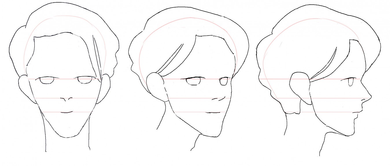
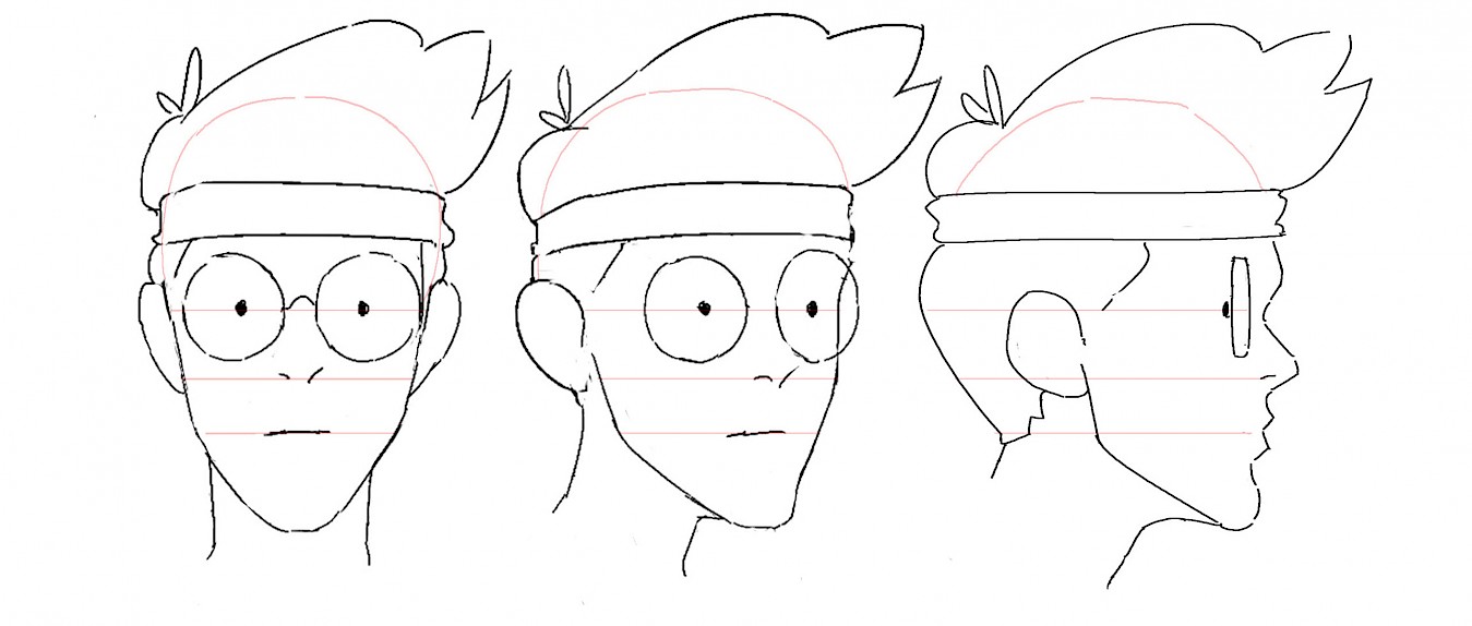
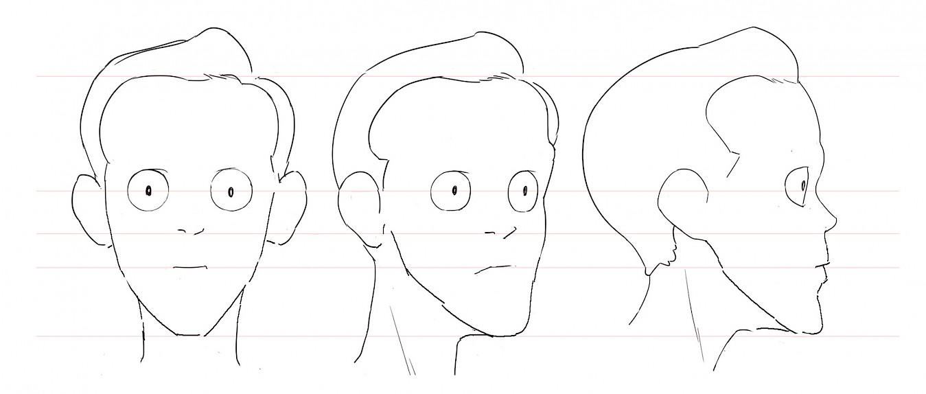
Afterwards I plastered my workspace with these sheets, so I always had a suitable reference in sight while drawing.
And so the pre-production was finished, the concept was set in stone and the real production started. I hope I could give you a first good insight into the pre-production of our showreel. In the next blog post I will write about the production pipeline, the techniques used and show some animation breakdowns.
Until then!